
Case study
Ekonomická Inteligence by David Kučera
- Automated delivery of ebooks and Financial Coaching
- Built brand identity
- Built, designed and developed website
Who is David Kučera
David leads an advisory office where he and his eight-person team provide financial advice across several regions.
From my perspective David is the definition of a strong manager. He understands many fields, works well with people, and actively studies marketing. A huge bonus: he already had most of the content and sales strategy planned. He knew what he wanted to communicate long term, which values he stands for, and what every activity on social, the website, and newsletters was meant to achieve — with realistic expectations throughout.
About the project
The Ekonomická Inteligence site lets visitors look behind the scenes of David’s life, what led to his success, which obstacles he faced and where he stands now.
Through that story it becomes clear why David is worth listening to. The site offers practical, easy-to-apply content via ebooks, newsletters, articles, and short videos.
Motivated visitors can also book Financial Coaching services.
Challenge
Turn a clear content and sales strategy into a credible website, fix a design miss without charging extra, and automate ebook and coaching delivery so the team stays independent.
What did my systematic, strategic approach look like?
Intake questionnaire and meetings, the key to understanding the project
From the kickoff meetings and completed intake questionnaire I quickly understood Ekonomická Inteligence, the vision, the concept, and the content and sales strategy were clear.
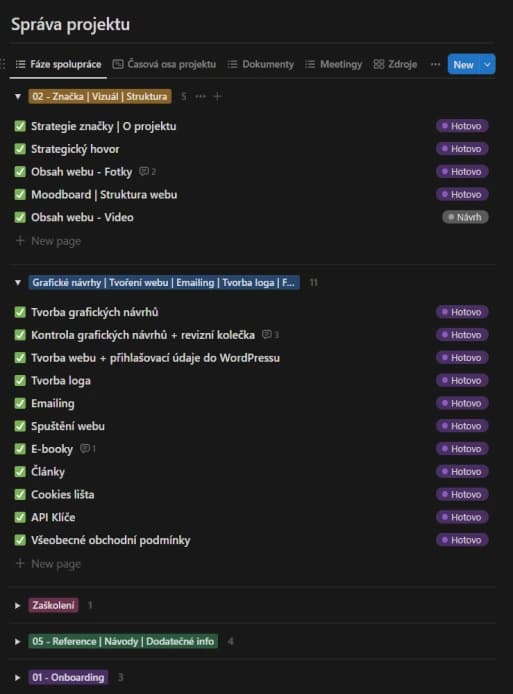
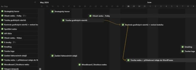
Client workspace and communication setup
I added David to the Notion client section used for assigning tasks, tracking progress, and collecting relevant project data.
I also invited him into Slack for day-to-day communication, and we set a weekly call cadence.
Designing the visual site structure
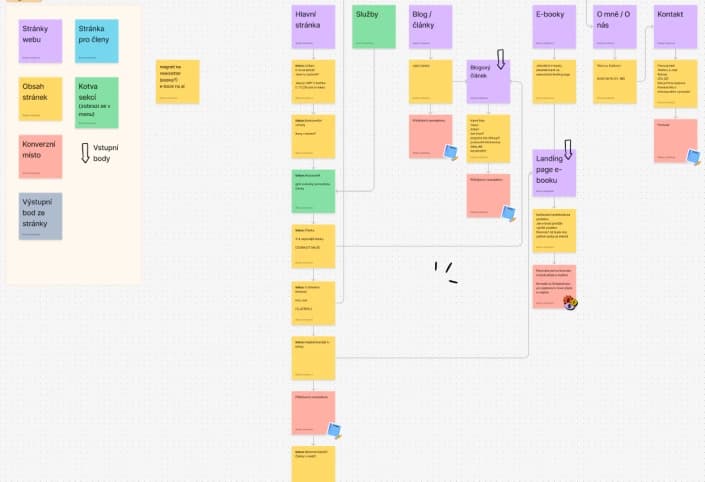
Based on discussions with David and the strategy work, I built a visual site structure that made clear:
- individual pages and content sections, so the project scope was obvious;
- where content would live and what each section was for;
- how pages connected — how easy navigation and orientation would be across the whole site.
3 main benefits of a visual structure
- Fewer misunderstandings and mis-set expectations.
- Higher efficiency — finish faster at the same or better quality.
- Dramatically fewer revision rounds later.
Graphic designs for every page
With brand positioning, content and sales strategy, and primary goals clear, I started designing.
Even with a detailed collaboration process, we hit the biggest obstacle — weak communication and lower-quality feedback. I trusted the systems and plans, but forgot that people still have to use the tools well.
The first graphic designs matched the brief and inputs, but neither David nor I were happy with them.
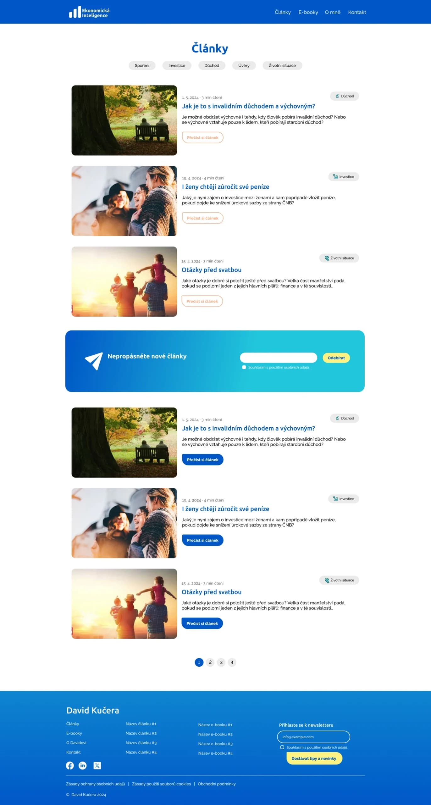
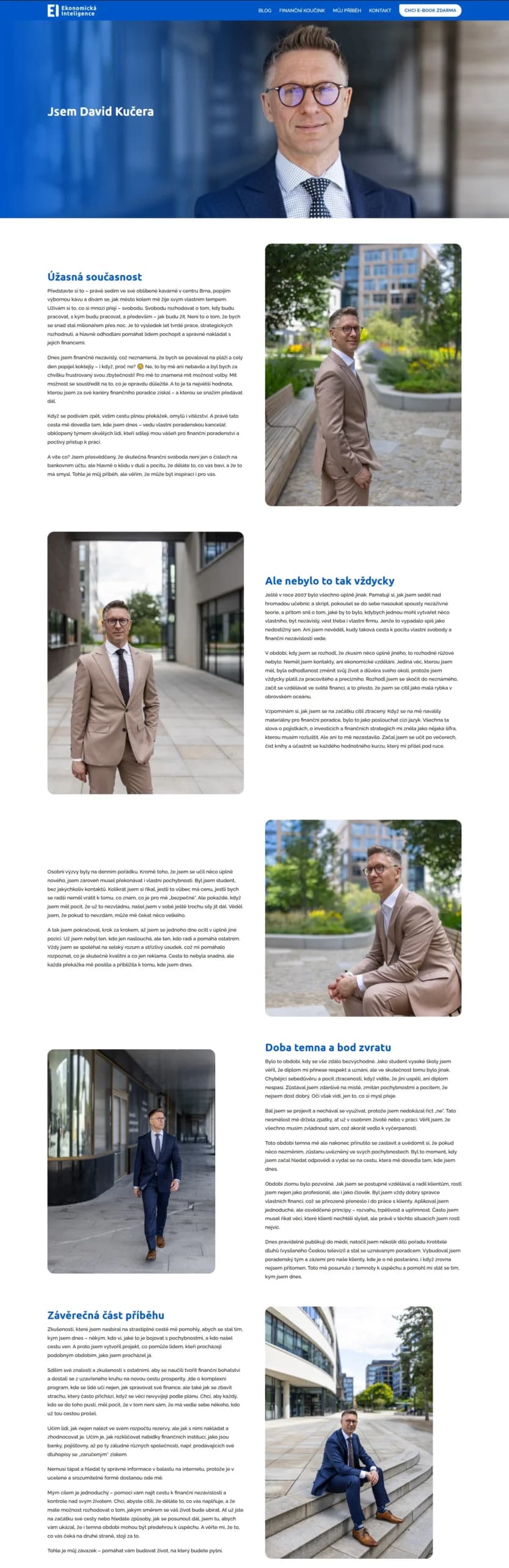
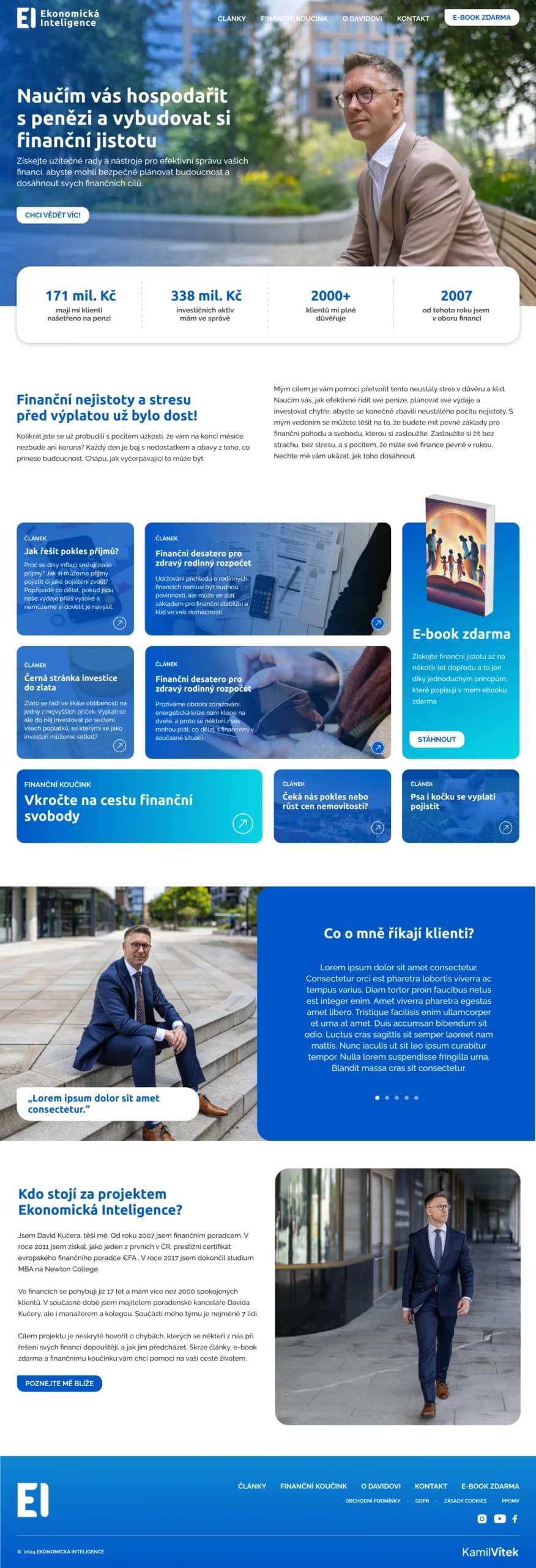
How I handled it — I took responsibility
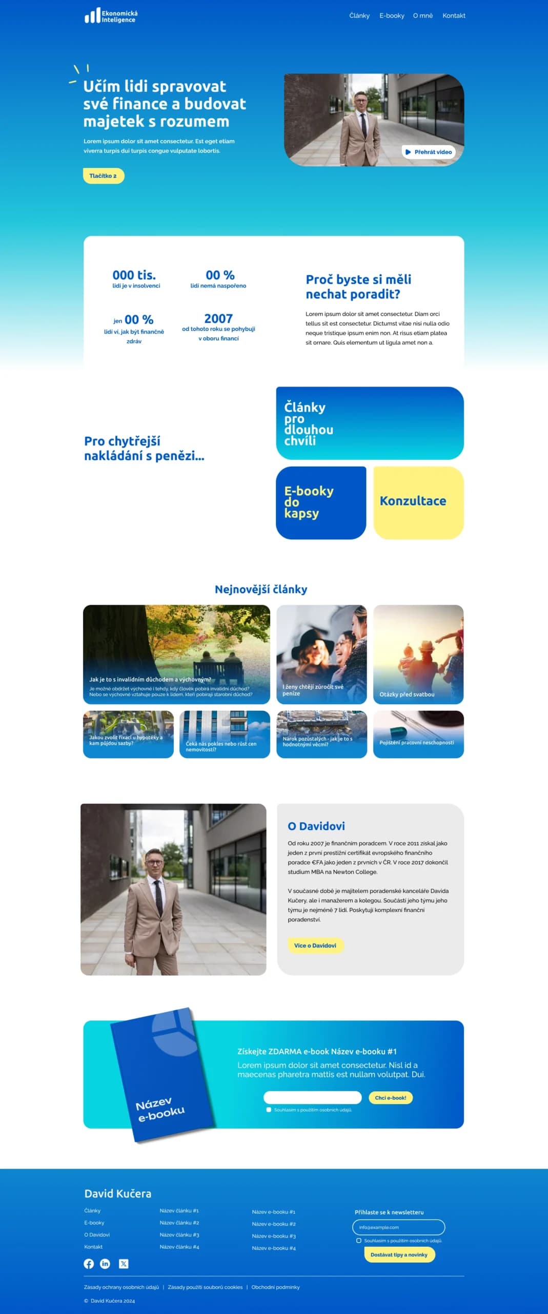
I can’t say what competitors would do, but I was clear: for an extra €0 I redesigned everything to match the brief, the strategy, and the client’s vision.
The result is clearly stronger than the first designs.
Building the website
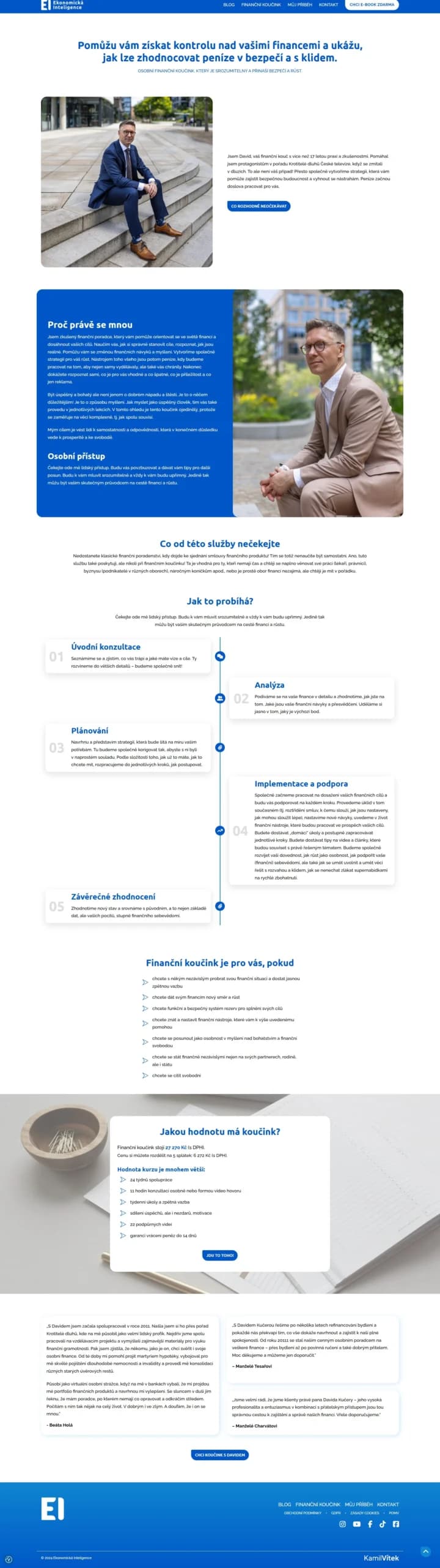
I built the site from the approved designs fairly quickly, including revision rounds where David’s feedback led to small polish that should still have a big impact on results.
The site runs on WordPress. After a short training, David and his team can upload articles and testimonials, edit copy, and make other small changes themselves — so they plan web-related investment more clearly and stay less dependent on me.
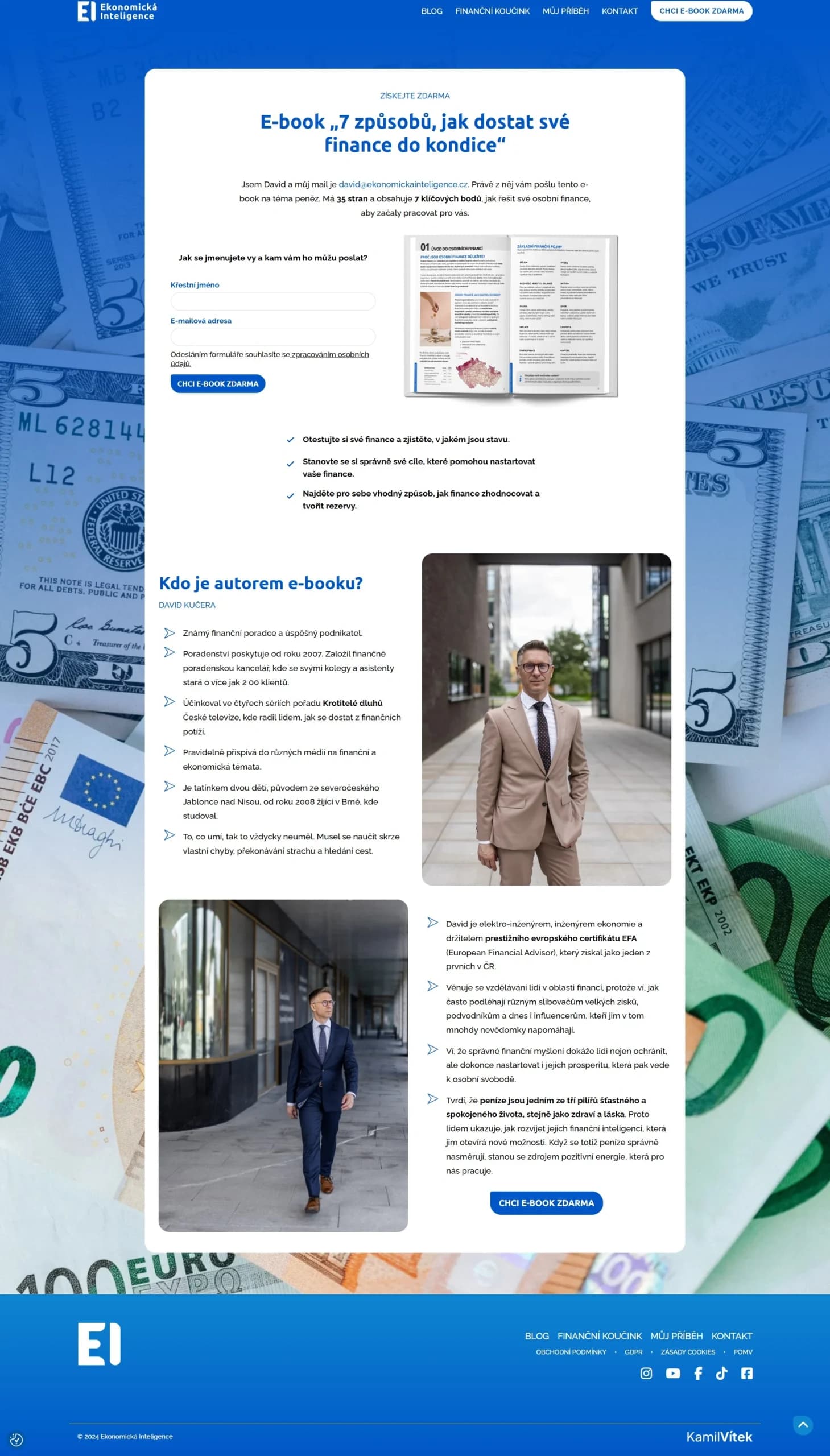
Automating ebook and Financial Coaching delivery
If David’s clients should grow through ebooks and Financial Coaching, delivery has to be clear, high quality, and simple.
David owns quality — nearly twenty years of experience and one of the strongest Partners advisory offices in Czechia. I owned clarity: two landing pages designed to convert interest. And I owned simplicity: full email setup while those pages were built.

Email setup from A–Y
Why skip “Z”? Because David chose to write the email copy himself.
- Contact segmentation.
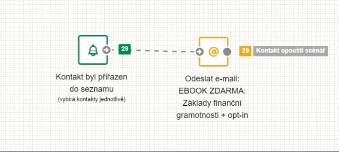
- Double opt-in automation for newsletters, the ebook, and Financial Coaching.
- Header and footer visuals and content.
Most interesting website features
- Intuitive testimonial uploads that auto-propagate into every relevant site section.
- Automatic display of the latest Instagram posts.
- Verified contact database growth through double opt-in campaigns.
- Contact form with background reCAPTCHA — visitors don’t click image puzzles.
- New contacts auto-added to the right list with automatic ebook or newsletter delivery.
Gallery

Client feedback
“What I appreciate most about working with Kamil is that he approaches it proactively, responsibly, and tries to resolve everything quickly. When something is new to him, he studies it and incorporates it. You can see he wants the client to be fully satisfied.
I honestly didn’t expect that kind of commitment, because my experience with people Kamil’s age is that they want everything done fast, make money, and move on. That is not his case!
It was almost miraculously remarkable how we found common ground with Kamil and created a new website that proves it. Thank you, Kamil! I wish you lasting enthusiasm, many satisfied clients, and I look forward to further collaboration. David Kučera.”

Ing. David Kučera, MBA, EFA
Manager of the VIP Consulting Office Partners advisory office in Brno, caring for more than 2,100 clients.